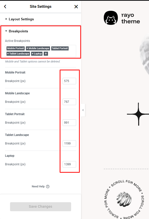
By default Elementor has 3 default breakpoints: Desktop, Tablet, Mobile. Our website has added some breakpoints to help it display well on all devices. Rayo theme includes 6 default breakpoints for building responsively.
| Breakpoint | Dimensions |
|---|---|
| Mobile Portrait | <576px |
| Mobile Landscape | ≥576px |
| Tablet Portrait | ≥768px |
| Tablet Landscape | ≥992px |
| Laptop | ≥1200px |
| Desktop | ≥1400px |
You can add these breakpoints to your website to display well on devices like our demo.
– Enable or Edit Breakpoints in Elementor
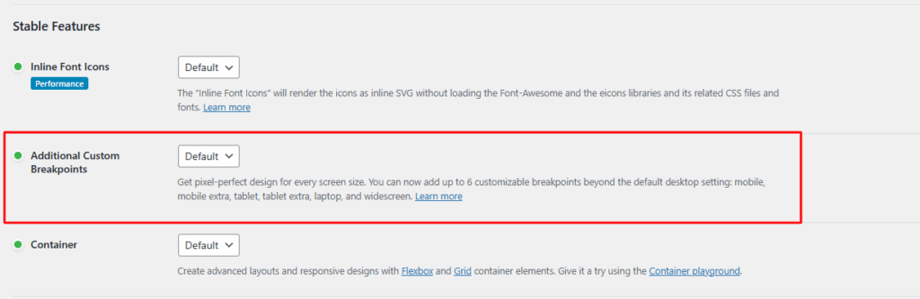
Step 1: Make sure that the Additional Custom Breakpoints feature is enabled. (Elementor Settings -> Features -> Additional Custom Breakpoints) In the latest versions of Elementor, this feature is enabled by default.
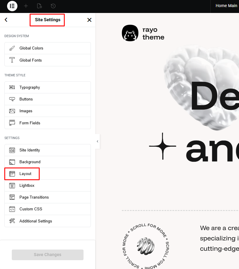
Step 2: Go to Site Settings -> Layout
Step 3: Navigate to tab Breakpoints to add breakpoints